Section 3.1: Measuring Civilian Victimization during Wartime
## load data
data("afghan", package = "qss")

## summarize variables of interest
summary(afghan$age)
##    Min. 1st Qu.  Median    Mean 3rd Qu.    Max.
##   15.00   22.00   30.00   32.39   40.00   80.00
summary(afghan$educ.years)
##    Min. 1st Qu.  Median    Mean 3rd Qu.    Max.
##   0.000   0.000   1.000   4.002   8.000  18.000
summary(afghan$employed)
##    Min. 1st Qu.  Median    Mean 3rd Qu.    Max.
##  0.0000  0.0000  1.0000  0.5828  1.0000  1.0000
summary(afghan$income)
##    Length     Class      Mode
##      2754 character character
prop.table(table(ISAF = afghan$violent.exp.ISAF,
                 Taliban = afghan$violent.exp.taliban))
##     Taliban
## ISAF         0         1
##    0 0.4953445 0.1318436
##    1 0.1769088 0.1959032
Section 3.2: Handling Missing Data in R
## print income data for first 10 respondents
head(afghan$income, n = 10)
##  [1] "2,001-10,000"  "2,001-10,000"  "2,001-10,000"  "2,001-10,000"
##  [5] "2,001-10,000"  NA              "10,001-20,000" "2,001-10,000"
##  [9] "2,001-10,000"  NA
## indicate whether respondents' income is missing
head(is.na(afghan$income), n = 10)
## [1] FALSE FALSE FALSE FALSE FALSE TRUE FALSE FALSE FALSE TRUE
sum(is.na(afghan$income)) # count of missing values
## [1] 154
mean(is.na(afghan$income)) # proportion missing
## [1] 0.05591866
x <- c(1, 2, 3, NA)
mean(x)
## [1] NA
mean(x, na.rm = TRUE)
## [1] 2
prop.table(table(ISAF = afghan$violent.exp.ISAF,
                 Taliban = afghan$violent.exp.taliban, exclude = NULL))
##       Taliban
## ISAF             0           1        <NA>
##   0    0.482933914 0.128540305 0.007988381
##   1    0.172476398 0.190994916 0.007988381
##   <NA> 0.002541757 0.002904866 0.003631082
afghan.sub <- na.omit(afghan)  # listwise deletion
nrow(afghan.sub)
## [1] 2554
length(na.omit(afghan$income))
## [1] 2600
Section 3.3: Visualizating the Univariate Distribution
Section 3.3.1: Bar Plot
par(cex = 1.5)
## a vector of proportions to plot
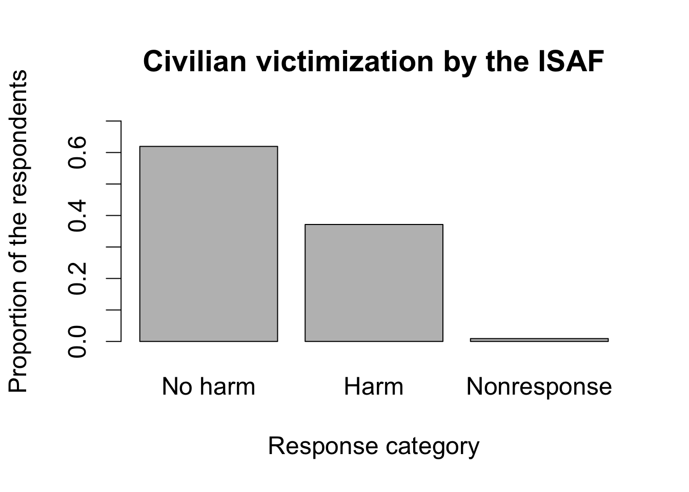
ISAF.ptable <- prop.table(table(ISAF = afghan$violent.exp.ISAF,
exclude = NULL))
ISAF.ptable
## ISAF
##           0           1        <NA>
## 0.619462600 0.371459695 0.009077705
## make barplots by specifying a certain range for y-axis
barplot(ISAF.ptable,
        names.arg = c("No harm", "Harm", "Nonresponse"),
        main = "Civilian victimization by the ISAF",
        xlab = "Response category",
        ylab = "Proportion of the respondents", ylim = c(0, 0.7))
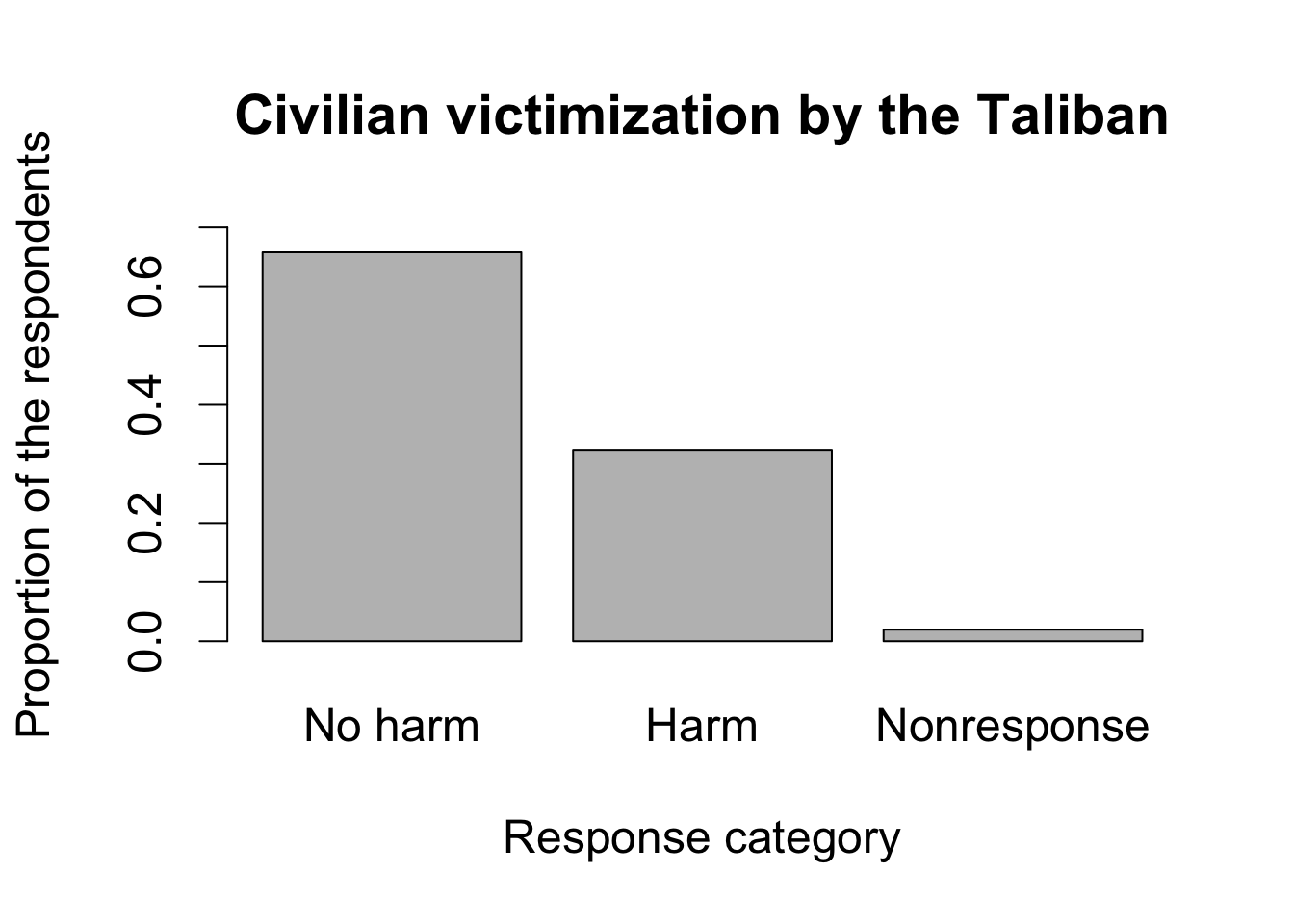
## repeat the same for the victimization by Taliban
Taliban.ptable <- prop.table(table(Taliban = afghan$violent.exp.taliban,
                         exclude = NULL))
barplot(Taliban.ptable,
        names.arg = c("No harm", "Harm", "Nonresponse"),
        main = "Civilian victimization by the Taliban",
        xlab = "Response category",
        ylab = "Proportion of the respondents", ylim = c(0, 0.7))
Section 3.3.2: Histogram
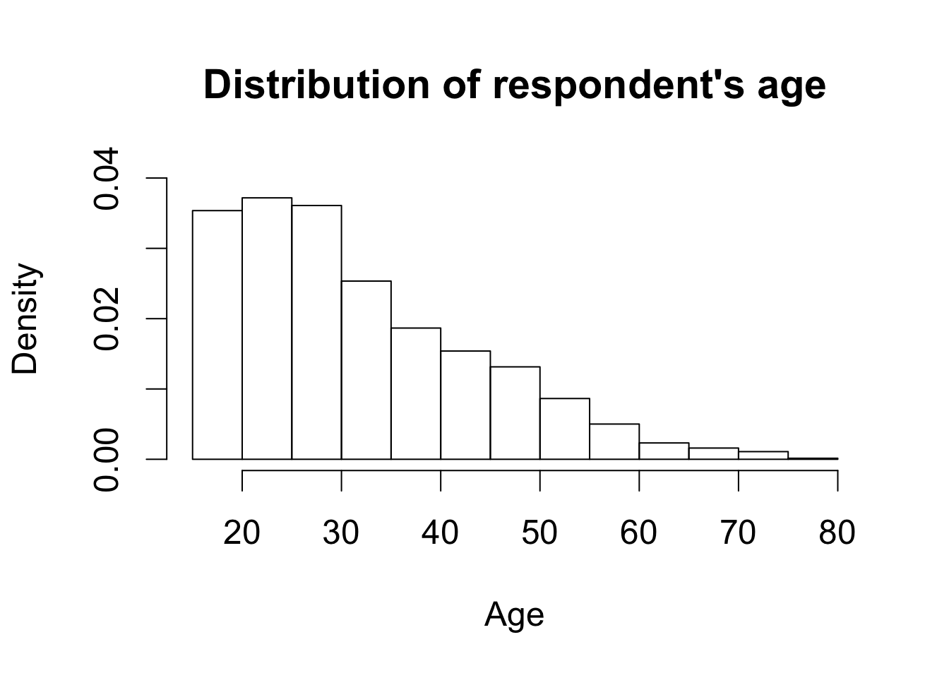
par(cex = 1.5)
hist(afghan$age, freq = FALSE, ylim = c(0, 0.04), xlab = "Age",
     main = "Distribution of respondent's age")
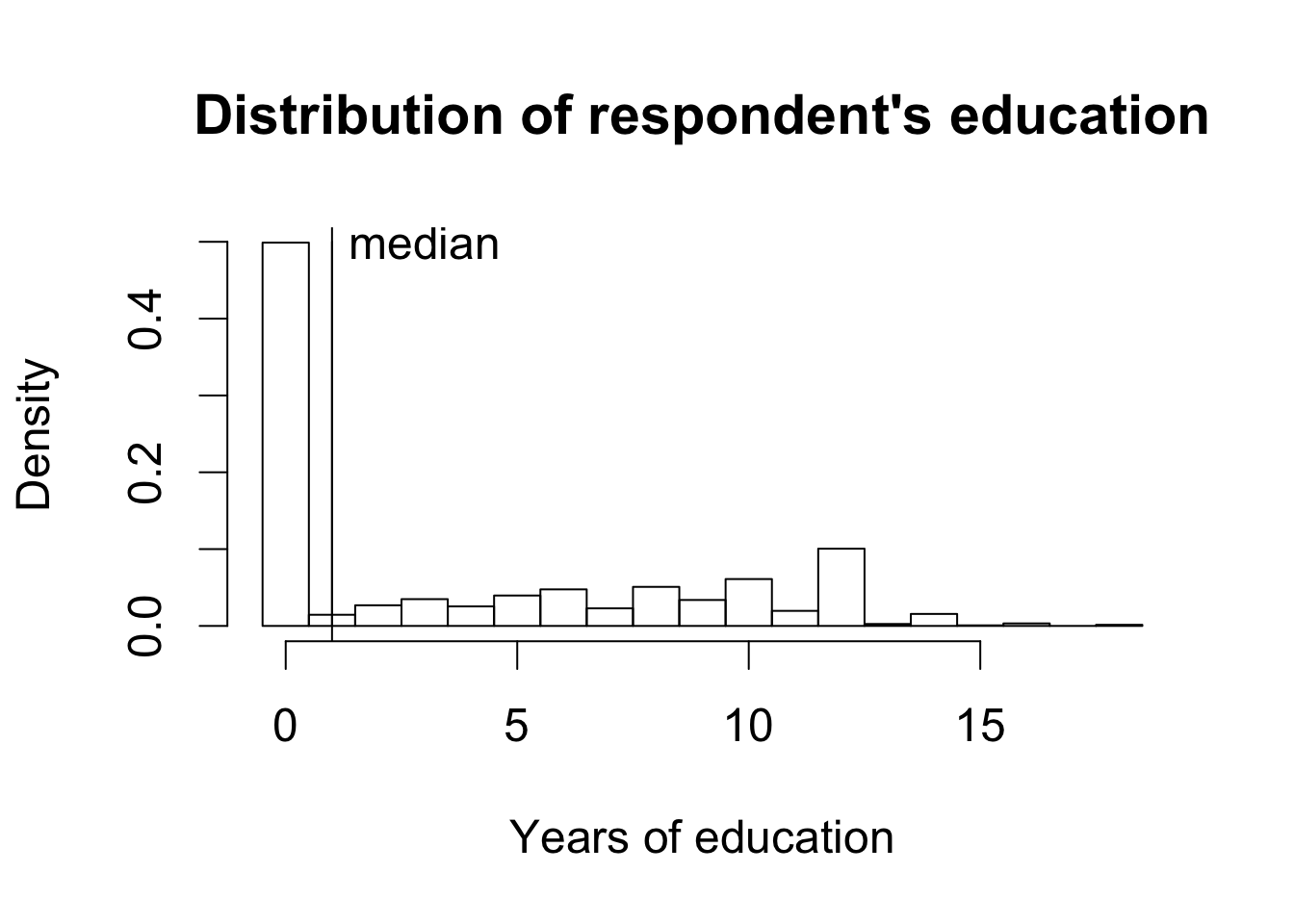
par(cex = 1.5)
## histogram of education.  use `breaks' to choose bins
hist(afghan$educ.years, freq = FALSE,
     breaks = seq(from = -0.5, to = 18.5, by = 1),
     xlab = "Years of education",
     main = "Distribution of respondent's education")

## add a text label at (x, y) = (3, 0.5)
text(x = 3, y = 0.5, "median")

## add a vertical line representing median
abline(v = median(afghan$educ.years))

## adding a vertical line representing median
lines(x = rep(median(afghan$educ.years), 2), y = c(0, 0.5))
Section 3.3.3: Box Plot
par(cex = 1.25)
boxplot(educ.years ~ province, data = afghan,
        main = "Education by province", ylab = "Years of education")
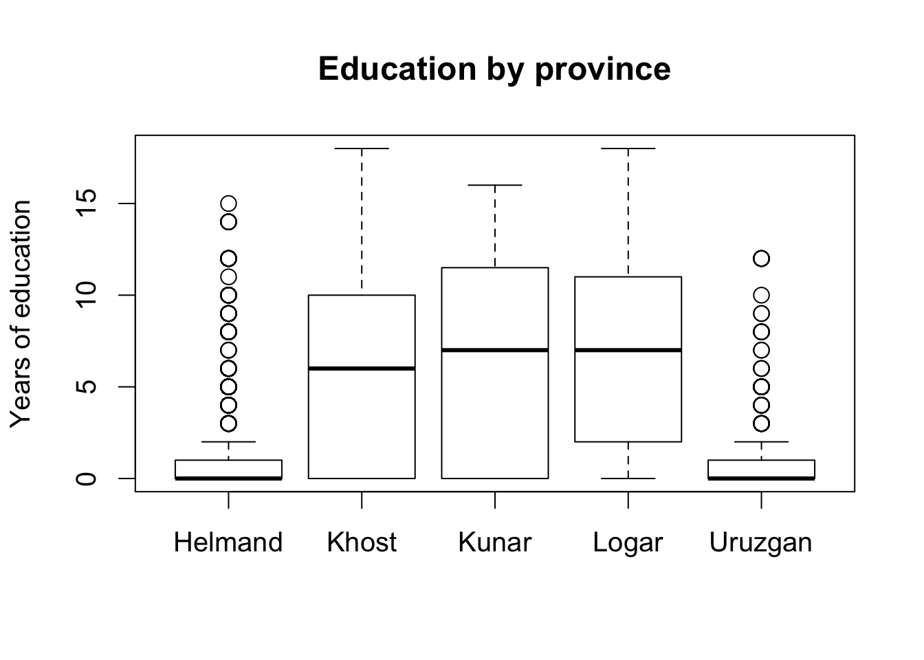
tapply(afghan$violent.exp.taliban, afghan$province, mean, na.rm = TRUE)
##    Helmand      Khost      Kunar      Logar    Uruzgan
## 0.50422195 0.23322684 0.30303030 0.08024691 0.45454545
tapply(afghan$violent.exp.ISAF, afghan$province, mean, na.rm = TRUE)
##   Helmand     Khost     Kunar     Logar   Uruzgan
## 0.5410226 0.2424242 0.3989899 0.1440329 0.4960422
## Saving or Printing a Graph

## pdf(file = "educ.pdf", height = 5, width = 5)
## boxplot(educ.years ~ province, data = afghan,
##         main = "Education by Province", ylab = "Years of education")
## dev.off()
## pdf(file = "hist.pdf", height = 4, width = 8)
## ## one row with 2 plots with font size 0.8
## par(mfrow = c(1, 2), cex = 0.8)
## ## for simplicity omit the texts and lines from the earlier example
## hist(afghan$age, freq = FALSE,
##      xlab = "Age", ylim = c(0, 0.04),
##      main = "Distribution of Respondent's Age")
## hist(afghan$educ.years, freq = FALSE,
##      breaks = seq(from = -0.5, to = 18.5, by = 1),
##      xlab = "Years of education", xlim = c(0, 20),
##      main = "Distribution of Respondent's Education")
## dev.off()
Section 3.4: Survey Sampling
Section 3.4.1: The Role of Randomization
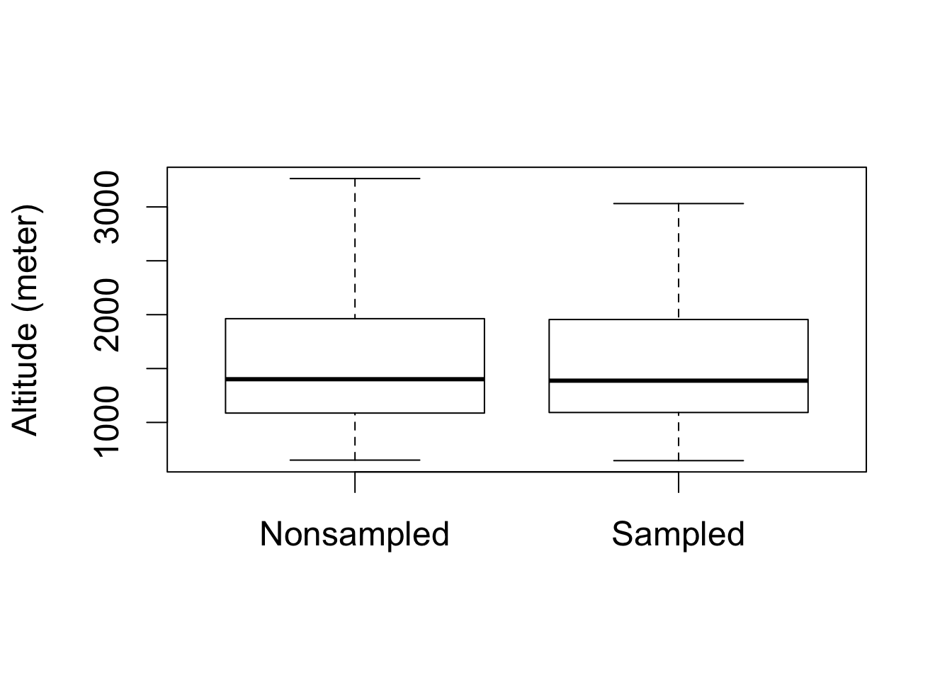
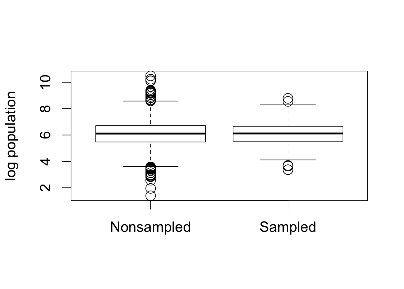
par(cex = 1.5)

## load village data
data("afghan.village", package = "qss")

## boxplots for altitude
boxplot(altitude ~ village.surveyed, data = afghan.village,
        ylab = "Altitude (meter)", names = c("Nonsampled", "Sampled"))
## boxplots for log population
boxplot(log(population) ~ village.surveyed, data = afghan.village,
        ylab = "log population", names = c("Nonsampled", "Sampled"))
Section 3.4.2: Nonresponse and Other Sources of Bias
tapply(is.na(afghan$violent.exp.taliban), afghan$province, mean)
##     Helmand       Khost       Kunar       Logar     Uruzgan
## 0.030409357 0.006349206 0.000000000 0.000000000 0.062015504
tapply(is.na(afghan$violent.exp.ISAF), afghan$province, mean)
##     Helmand       Khost       Kunar       Logar     Uruzgan
## 0.016374269 0.004761905 0.000000000 0.000000000 0.020671835
mean(afghan$list.response[afghan$list.group == "ISAF"]) -
    mean(afghan$list.response[afghan$list.group == "control"])
## [1] 0.04901961
table(response = afghan$list.response, group = afghan$list.group)
##         group
## response control ISAF taliban
##        0     188  174       0
##        1     265  278     433
##        2     265  260     287
##        3     200  182     198
##        4       0   24       0
Section 3.6: Summarizing Bivariate Relationships
Section 3.6.1: Scatter Plot
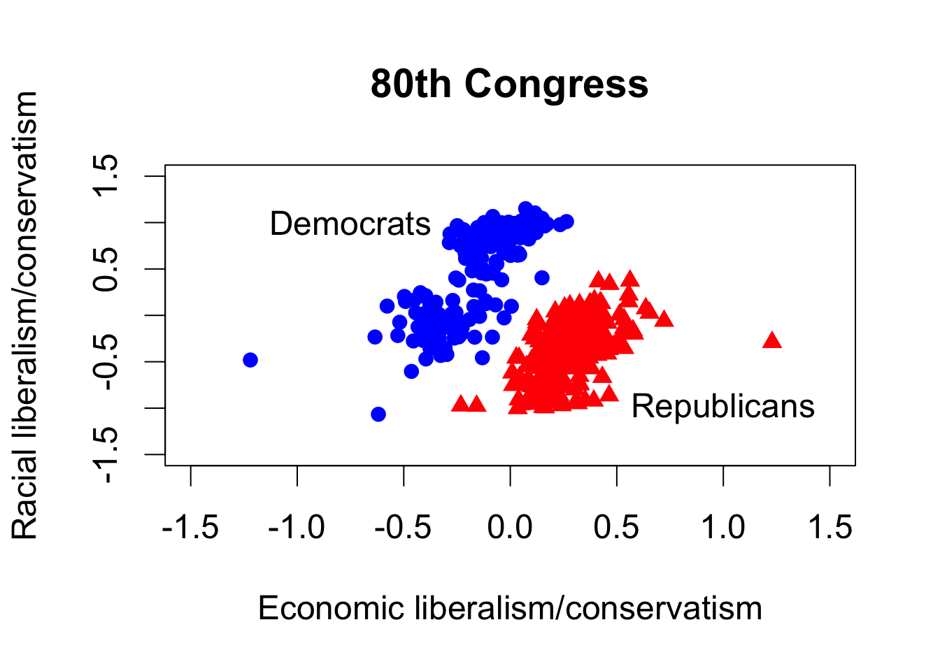
data("congress", package = "qss")

## subset the data by party
rep <- subset(congress, subset = (party == "Republican"))
dem <- congress[congress$party == "Democrat", ] # another way to subset

## 80th and 112th congress
rep80 <- subset(rep, subset = (congress == 80))
dem80 <- subset(dem, subset = (congress == 80))
rep112 <- subset(rep, subset = (congress == 112))
dem112 <- subset(dem, subset = (congress == 112))

## preparing the labels and axis limits to avoid repetition
xlab <- "Economic liberalism/conservatism"
ylab <- "Racial liberalism/conservatism"
lim <- c(-1.5, 1.5)

par(cex = 1.5)
## scatterplot for the 80th Congress
plot(dem80$dwnom1, dem80$dwnom2, pch = 16, col = "blue",
     xlim = lim, ylim = lim, xlab = xlab, ylab = ylab,
     main = "80th Congress") # democrats
points(rep80$dwnom1, rep80$dwnom2, pch = 17, col = "red") # republicans
text(-0.75, 1, "Democrats")
text(1, -1, "Republicans")
## scatterplot for the 112th Congress
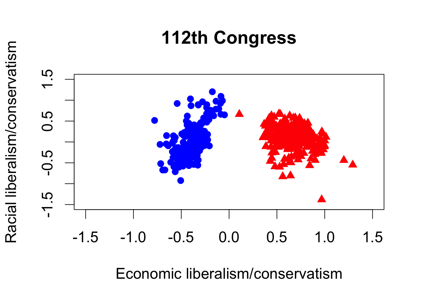
plot(dem112$dwnom1, dem112$dwnom2, pch = 16, col = "blue",
xlim = lim, ylim = lim, xlab = xlab, ylab = ylab,
main = "112th Congress")
points(rep112$dwnom1, rep112$dwnom2, pch = 17, col = "red")
## party median for each congress
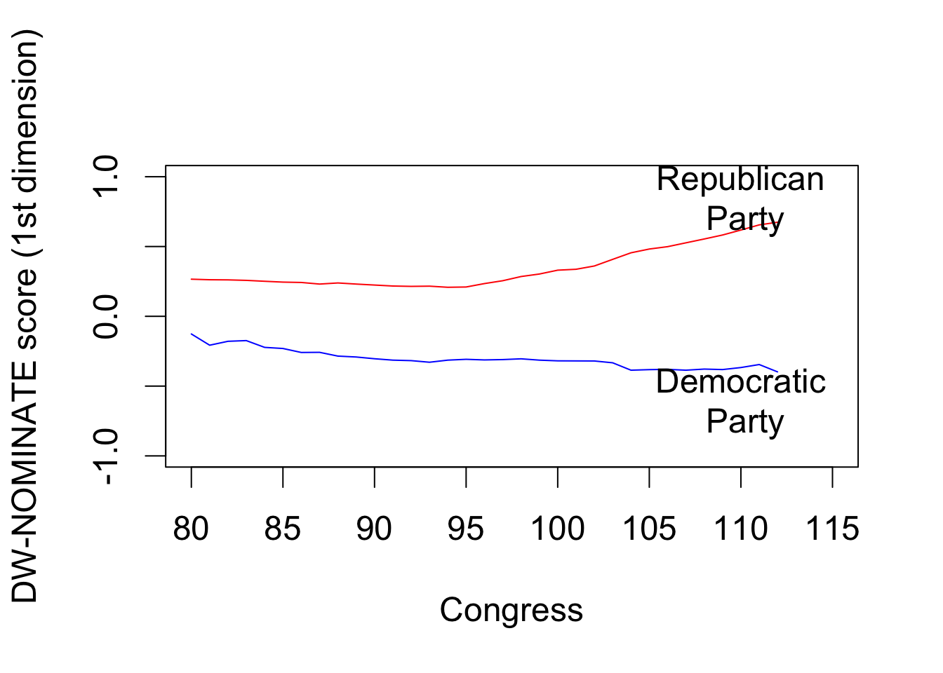
dem.median <- tapply(dem$dwnom1, dem$congress, median)
rep.median <- tapply(rep$dwnom1, rep$congress, median)
par(cex = 1.5)
## Democrats
plot(names(dem.median), dem.median, col = "blue", type = "l",
xlim = c(80, 115), ylim = c(-1, 1), xlab = "Congress",
ylab = "DW-NOMINATE score (1st dimension)")
## add Republicans
lines(names(rep.median), rep.median, col = "red")
text(110, -0.6, "Democratic\n Party")
text(110, 0.85, "Republican\n Party")
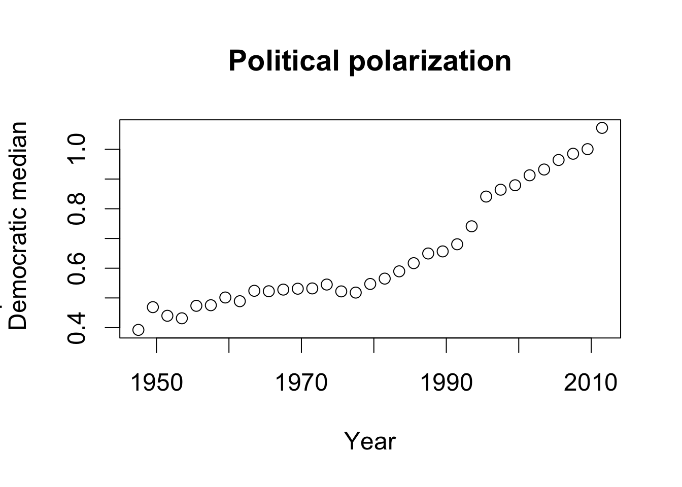
Section 3.6.2: Correlation
par(cex = 1.5)
## Gini coefficient data
data("USGini", package = "qss")

## time-series plot for partisan difference
plot(seq(from = 1947.5, to = 2011.5, by = 2),
     rep.median - dem.median, xlab = "Year",
     ylab = "Republican median -\n Democratic median",
     main = "Political polarization")
## time-series plot for Gini coefficient
plot(USGini$year, USGini$gini, ylim = c(0.35, 0.45), xlab = "Year",
     ylab = "Gini coefficient", main = "Income inequality")
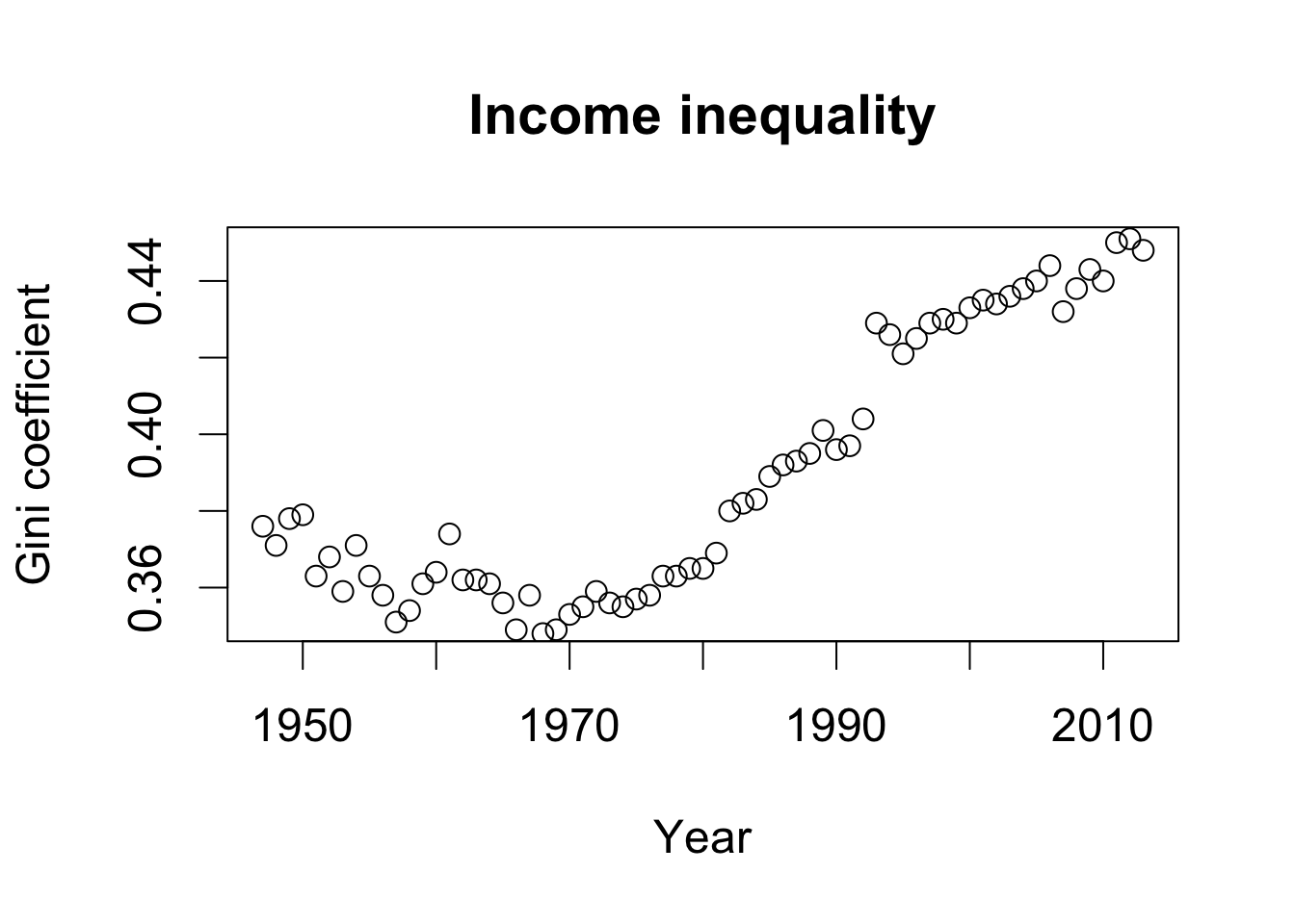
cor(USGini$gini[seq(from = 2, to = nrow(USGini), by = 2)],
    rep.median - dem.median)
## [1] 0.9418128
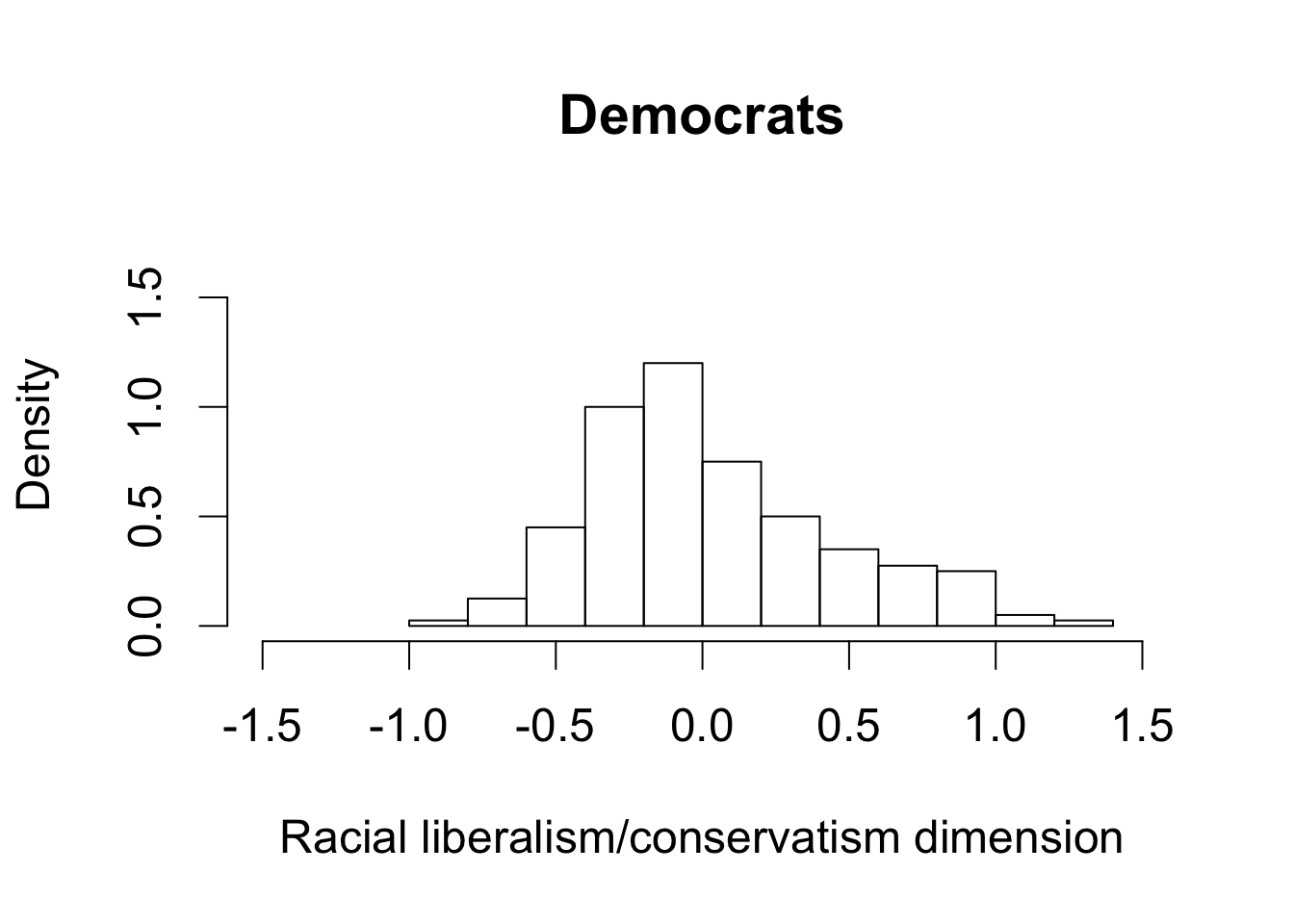
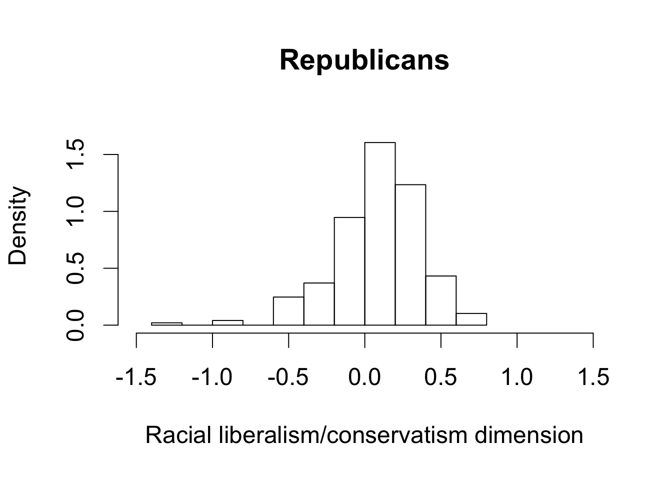
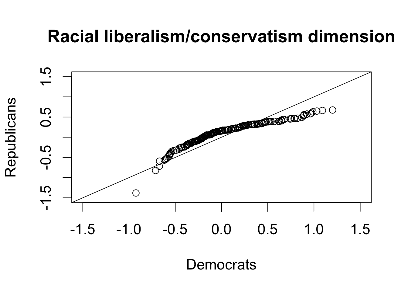
Section 3.6.3: Quantile-Quantile Plot
par(cex = 1.5)
hist(dem112$dwnom2, freq = FALSE, main = "Democrats",
     xlim = c(-1.5, 1.5), ylim = c(0, 1.75),
     xlab = "Racial liberalism/conservatism dimension")
hist(rep112$dwnom2, freq = FALSE, main = "Republicans",
     xlim = c(-1.5, 1.5), ylim = c(0, 1.75),
     xlab = "Racial liberalism/conservatism dimension")
par(cex = 1.5)
qqplot(dem112$dwnom2, rep112$dwnom2, xlab = "Democrats",
       ylab = "Republicans", xlim = c(-1.5, 1.5), ylim = c(-1.5, 1.5),
       main = "Racial liberalism/conservatism dimension")
abline(0, 1) # 45 degree line
Section 3.7: Clustering
## 3x4 matrix filled by row; first argument take actual entries
x <- matrix(1:12, nrow = 3, ncol = 4, byrow = TRUE)
rownames(x) <- c("a", "b", "c")
colnames(x) <- c("d", "e", "f", "g")
dim(x) # dimension
## [1] 3 4
x
##   d  e  f  g
## a 1  2  3  4
## b 5  6  7  8
## c 9 10 11 12
## data frame can take different data types
y <- data.frame(y1 = as.factor(c("a", "b", "c")), y2 = c(0.1, 0.2, 0.3))
class(y$y1)
## [1] "factor"
class(y$y2)
## [1] "numeric"
## as.matrix() converts both variables to character
z <- as.matrix(y)
z
##      y1  y2
## [1,] "a" "0.1"
## [2,] "b" "0.2"
## [3,] "c" "0.3"
## column sums
colSums(x)
##  d  e  f  g
## 15 18 21 24
## row means
rowMeans(x)
##    a    b    c
##  2.5  6.5 10.5
## column sums
apply(x, 2, sum)
##  d  e  f  g
## 15 18 21 24
## row means
apply(x, 1, mean)
##    a    b    c
##  2.5  6.5 10.5
## standard deviation for each row
apply(x, 1, sd)
##        a        b        c
## 1.290994 1.290994 1.290994
Section 3.7.2: List in R
## create a list
x <- list(y1 = 1:10, y2 = c("hi", "hello", "hey"),
          y3 = data.frame(z1 = 1:3, z2 = c("good", "bad", "ugly")))
## 3 ways of extracting elements from a list
x$y1 # first element
## [1] 1 2 3 4 5 6 7 8 9 10
x[[2]] # second element
## [1] "hi" "hello" "hey"
x[["y3"]] # third element
##   z1   z2
## 1  1 good
## 2  2  bad
## 3  3 ugly
Section 3.7.3: The k-Means Algorithm
names(x) # names of all elements
## [1] "y1" "y2" "y3"
length(x) # number of elements
## [1] 3
dwnom80 <- cbind(congress$dwnom1[congress$congress == 80],
                 congress$dwnom2[congress$congress == 80])
dwnom112 <- cbind(congress$dwnom1[congress$congress == 112],
                 congress$dwnom2[congress$congress == 112])

## kmeans with 2 clusters
k80two.out <- kmeans(dwnom80, centers = 2, nstart = 5)
k112two.out <- kmeans(dwnom112, centers = 2, nstart = 5)

## elements of a list
names(k80two.out)
## [1] "cluster"      "centers"      "totss"        "withinss"
## [5] "tot.withinss" "betweenss"    "size"         "iter"
## [9] "ifault"
## final centroids
k80two.out$centers
##          [,1]       [,2]
## 1  0.14681029 -0.3389293
## 2 -0.04843704  0.7827259
k112two.out$centers
##         [,1]       [,2]
## 1 -0.3912687 0.03260696
## 2  0.6776736 0.09061157
## number of observations for each cluster by party
table(party = congress$party[congress$congress == 80],
      cluster = k80two.out$cluster)
##             cluster
## party          1   2
##   Democrat    62 132
##   Other        2   0
##   Republican 247   3
table(party = congress$party[congress$congress == 112],
      cluster = k112two.out$cluster)
##             cluster
## party          1   2
##   Democrat   200   0
##   Republican   1 242
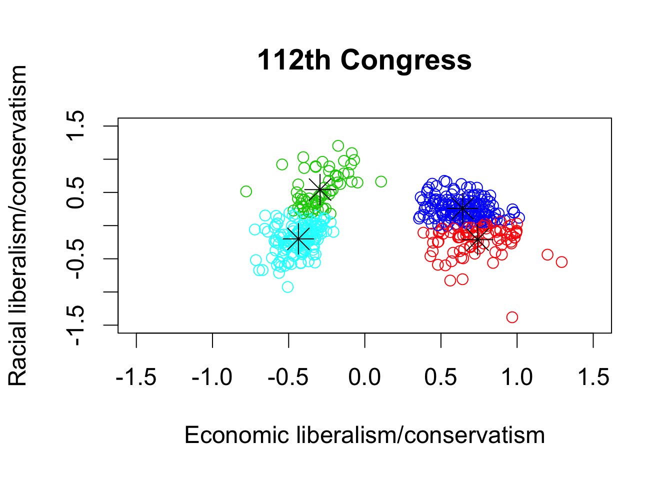
## kmeans with 4 clusters
k80four.out <- kmeans(dwnom80, centers = 4, nstart = 5)
k112four.out <- kmeans(dwnom112, centers = 4, nstart = 5)

par(cex = 1.5)
## plotting the results using the labels and limits defined earlier
plot(dwnom80, col = k80four.out$cluster + 1, xlab = xlab, ylab = ylab,
     xlim = lim, ylim = lim, main = "80th Congress")

## plotting the centroids
points(k80four.out$centers, pch = 8, cex = 2)
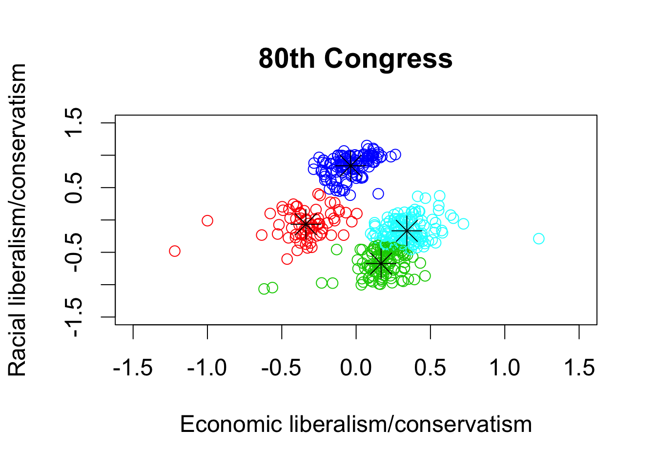
## 112th congress
plot(dwnom112, col = k112four.out$cluster + 1, xlab = xlab, ylab = ylab,
     xlim = lim, ylim = lim, main = "112th Congress")
points(k112four.out$centers, pch = 8, cex = 2)
palette()
## [1] "black"   "red"     "green3"  "blue"    "cyan"    "magenta" "yellow"
## [8] "gray"